Having a website is no longer an option for businesses. It is a critical requirement. And most importantly, the website that you develop for your business must fulfill certain design standards.
A compelling website can help your business grab attention, engage customers, and establish the credibility of your business online. A website’s design greatly impacts how your potential customers perceive your brand.
Even the slightest glitch in the design can drive users away. If your website looks outdated and unappealing, it can negatively impact your business.
Aiming towards creating a fantastic user experience with a well-designed website, let us review the web design mistakes that must be avoided and eliminated.
1. Non-responsive Design
Let us first understand whatonsive web design means.
In web designing, responsive design is an approach to creating websites that work and look good on any device, be it a large desktop screen, a laptop, tablet, or the smallest of smartphone screens. Responsive design optimizes a website to the user’s screen.
Today, many people use different smartphone devices other than a computer to browse and search on the web.
If your website automatically adapts to the visitor’s device, it allows users to spend more time browsing your site and keeps them engaged longer.
On the other hand, a non-responsive or unresponsive website –
- Poorly impacts the user experience
- Generates poor web layout when a different device is used for browsing, leading to poor readability and low-quality images
- Is difficult to navigate
- Is not mobile-friendly
How can we avoid creating a non-responsive design?
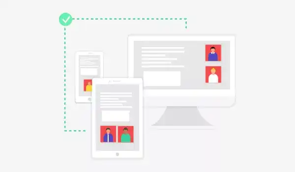
Try using a mobile-first approach when creating a new website. Make sure the website elements load perfectly on small screens. And then start working your way up to the larger screens of devices like tablets and laptops etc.
Place a strong emphasis on creating quality user interfaces and experience (UX/UI) for mobile devices.
Web developers can use tools like Media Queries and CSS3 Modules for hiding, showing, moving, or adjusting the size of content according to screen resolutions and device sizes.
2. Disruptive Pop-ups
Many of us stumble upon pop-ups while web browsing. They appear suddenly, asking if you need help or prompting you to subscribe and download.
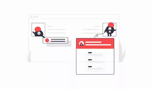
But rather than finding them helpful, many users often find them annoying because they obstruct the view and disrupt navigation.
Apart from the reason mentioned above, there are many other reasons as to why users dislike pop-ups.
- Pop-ups can distract and confuse visitors.
- They can lower UX.
- Many users perceive them with suspicion and think of them as malware.
- They force a user to take action.
- They can lead to a high bounce rate when users who don’t want to deal with them leave the site.
- They can damage a brand’s reputation if not used carefully.
- They look incredibly awful on mobile if not designed with care.
Now, despite all the reasons mentioned above, many companies still use them on their websites because:
- Pop-ups catch website visitor’s attention.
- They help to keep visitors on the webpage a little longer
- They stop visitors from exiting the website right away
- Pop-ups have ROI potential.
Pop-ups get the conversion. In 2020, the average conversion rate of pop-ups is calculated at 3.09%.
They are versatile and can be used at various points – upon entry, after scrolling to a certain point, right before exiting, or triggered by a specific action.
But, they can also lead to poor user experience, and hence you need to be extra careful when implementing popups on your website.
How can we avoid making mistakes in the use of pop-ups?
- Do follow Google’s rules for pop-ups on mobiles and create non-obtrusive, device-specific pop-ups.
- Add pop-ups only when you’re sure they’re offering something of value to visitors. They shouldn’t waste the visitor’s time with any meaningless disruption.
- Don’t be lazy while designing pop-ups. Design them to be just as good as the rest of your website.
- Make sure they are responsive.
- Be minimalist in terms of collecting visitor’s contact information and deciding the content for pop-ups.
- If possible, avoid showing pop-ups immediately after the visitor starts navigating.
- Always include an easy way for the visitor to exit out of the pop-up by placing an “X” button for him/her in the top-right.
- The right timing of your pop-ups can create just the right on-site experience for your visitor.
It’s also important to ensure that the pop-ups are placed on the right location of your website
- Intruding pop-ups can be placed in the center of the screen.
- Pop-ups with special offers can be placed with a sticky bar.
- If visitors need to be given some time to contemplate as they navigate around the website, pop-ups can be placed to the side.
Lastly, be selective – don’t show pop-ups on every single page of your website.
3. Content isn’t scannable
Have you noticed we tend to read slower on the screen than reading from a printed book – almost 25% slower? In fact, we don’t even read online, we skim.
Web content has to be scannable because visitors don’t have the patience to stay at a single website for too long.
So, when they land on a website with walls of text, it can prove an intimidating and tedious experience. Nobody likes to read through walls of text.
Also, there are other distractions on a website trying to grab the visitor’s attention – photos, hyperlinks, animations, video, etc.
Remember, writing content for a website is different from writing for print material, therefore it should be easily scannable.
How can we avoid writing content that is not scannable?
- Avoid extra details
- Follow a simple writing style
- Your content should be short and to the point.
- Use sub-headings, bulleted lists, short paragraphs, and highlighted keywords.
- Use pictures to convey some points by adding smaller captions.
- Add sufficient white space to prevent the screen from looking crowded.
- Provide links to content when you want to provide visitors with additional information.
4. Auto-playing video with sound
Adding video to websites is helpful. If used appropriately, it can help you capture your website visitor’s attention and get you conversions.
But what is not okay is to auto-play a video on your website without the consent and expectation of the person visiting your site.
There are some sites where it is acceptable and expected for videos to auto-play – like websites covering news or professional sports.
However, it is a frustrating experience for visitors when they click on a web page link or browse for a particular page, and just as the page opens, a video starts to play out of the blue.
Rather than trying to look for a mute option, many visitors tend to leave the page immediately.
What’s the solution?
Remember that nothing should be pushed on users – therefore, auto-playing video with sound may seem like an aggressive approach.
Perform an A/B test for two versions of your video – one with auto-play and the other where users control playing the video.
If you must auto-play a video, mute it. Learn from how Twitter and Facebook use silent auto-play video where the user sees the video playing automatically but has to activate the sound manually.
5. Navigation issues
In an age where everything is delivered instantly, anything longer will make people abandon your website.
Website navigation allows visitors to move from one page to another without frustration. If your website has issues within its navigation, users will not find your content. No content discovery will mean no conversions.

Let’s take a look at how we can avoid making navigation mistakes in our web design.
How can we avoid making navigation mistakes?
- Make hypertext in your website obvious – Visitors should be able to tell a hyperlink from a body text – format it in a different color, boldface it, or underline it.
- Sidebars shouldn’t look like the rest of the web content. It should stand out.
- Streamline the navigation bar – remove clutter and follow a structure
- Use a simple and clear approach while naming the hyperlinks.
- Make sure the website’s navigation is responsive on mobile.
- Use buttons only for CTA – Calls to Action
- Use evaluation tools meant for checking how your users are navigating the website.
- Make sure the color of visited links change – so that they figure out where they are and where they’ve been.
- Avoid using uncontrollable navigation in the form of animation that rolls, bounces, or moves while the users are trying to read something on your website.
6. Slow loading
If your website takes more than four seconds to load, it’s too slow. For a mobile, the ideal website load time is one to two seconds.
Elements in your web design have a considerable impact on the page load time and, in turn, impact your website’s SEO ranking.
Let’s check what can be done to get rid of slow load time for the website.
What’s the solution for slow loading?
The image on the website has to be compressed. Unoptimized images are usually the most common reason behind website slowness – check the size of your images before uploading.
Try implementing cache functionalities on your website. Caching improves website performance. If you’re using WordPress CMS, you can find many cache plugins that can help you improve the performance of your website.
When you make your website, avoid unclean coding – excessive white space, inline styling, lots of comments can make the website style sheet grow large in size.
7. Typographical mistakes
Typography can impact the speed and comfort with which a website’s visitor reads written text. Choosing incorrect fonts and font-sizes is one of the many common mistakes committed by web designers.
When the text on a website is difficult to read, visitors lose interest.
How can we avoid typographical mistakes on our websites?
- Choose a clear font for your website – most cursive fonts and hand-drawn scripts are not meant for websites.
- Do not use too many types of fonts – not more than three. It creates confusion and looks unprofessional.
- Do not use conflicting fonts.
- Do not use a tiny font size. Ideally, the font size shouldn’t be less than 10 pt.
- Do not minimize the character spacing.
- Make limited use of text color. Avoid using blue for content text because it is usually the color of hyperlinks.
- Do check the content for spelling and grammatical mistakes.
8. Poor visual content
Websites with outdated styling, terrible color choices, and poor quality images or videos are huge barriers to keeping visitors on your website.
A visually appealing website generate a sense of trust and leadership.
How can we avoid the use of poor visual content?
- Be minimalist.
- Use not more than five colors in a single web layout.
- Avoid unnecessary designs.
- Use graphics that reflect the tone of your business.
9. Lack of Contact Information
This one is important to build credibility and acquire leads. Else it may cost you your clients.
Visitors look for a contact number, e-mail address, or some other form of support on your website. But if your website lacks easy access to this critical information, you may lose leads without realizing it.
What should be done?
- The Contact Us page should be easily accessible and must be just one click away for the visitor.
- Your information should be placed at the bottom of the web page.
- Add chatbots for live chat.
10. Links that open new browser windows
This, for sure, creates a bad user experience because users don’t like to deal with multiple opened tabs and may become upset to find a disabled back button. It also eats up network bandwidth – slowing the visitor’s device.
Some visitors may not even realize that a new window has actually opened, and they can repeatedly hit the back-button — without any result.
That’s not the good user experience web designers look for.
What should be done?
Most users expect the link to open in the same window; therefore setting your links to open in the same window is wise. Allow users the option to choose how the links should be opened on a given website.
11. The website is not secure
If your website isn’t hosted securely, i.e., if its URL starts with http rather than https – this can send out a warning signal to your visitor that can drive them away.
Besides, Google favors secure websites. So you may miss out on an SEO ranking. Browsers like Google Chrome warn people if they are about to visit a non-secure website.
It is especially risky if the website is built to facilitate monetary transactions or to collect user information.
Do not overlook the website security at any cost.
How can we avoid falling into the trap of not creating a secure website?
- Web developers should always upgrade to the latest versions of their plugins at regular intervals.
- Obtain an SSL – Secure Socket Layer certificate.
12. Poor Search
Website visitors use search to find what they’re looking for. Search is handy for visitors who look for specific information in large and complex websites.
Visitors on your website should be able to find exactly what they’re looking for as fast and as efficiently as possible. Bridging the gap between your visitors and the information they seek can be made possible by implementing a site search.
A good search can generate an increase in conversion and a decrease in the bounce rate. On the other hand, a poor search can negatively impact your business and drive away your leads.
What should be done?
-
Do not make your website visitors search for the search box.
-
Visitors may not type your idea of a perfect keyword. In that case, the search must:
- Allow case-insensitively by default.
- Understand singular, plural, and other variants.
- Ignore common misspellings and typos.
- Accommodate synonyms, abbreviations, and other alternate terminologies.
- Recognize both American and British English.
- Handle the use of numbers and special characters.
- Handle words such as “a”, “the”, “of”, “for”, “at”, “in” etc.
-
Encourage input by predicting search
Create a High-Performance Website with Imaginovation
Remember, there is no better time to check at your web strategy than right now. Start fixing the errors today and attain even greater success!
If you’re looking for a web development company that can help you create the website you and your customers will love, then get in touch with us.
We understand the importance of good web design. We can help you build an innovative and powerful web presence for your business or even help you upgrade an existing website.
We are an award-winning web and mobile app development agency with vast experience in crafting remarkable digital success stories for diverse companies.
